Lighting and Mood Descriptors That Improve AI Video Quality
Naming your light source beats describing a feeling in AI video prompts.
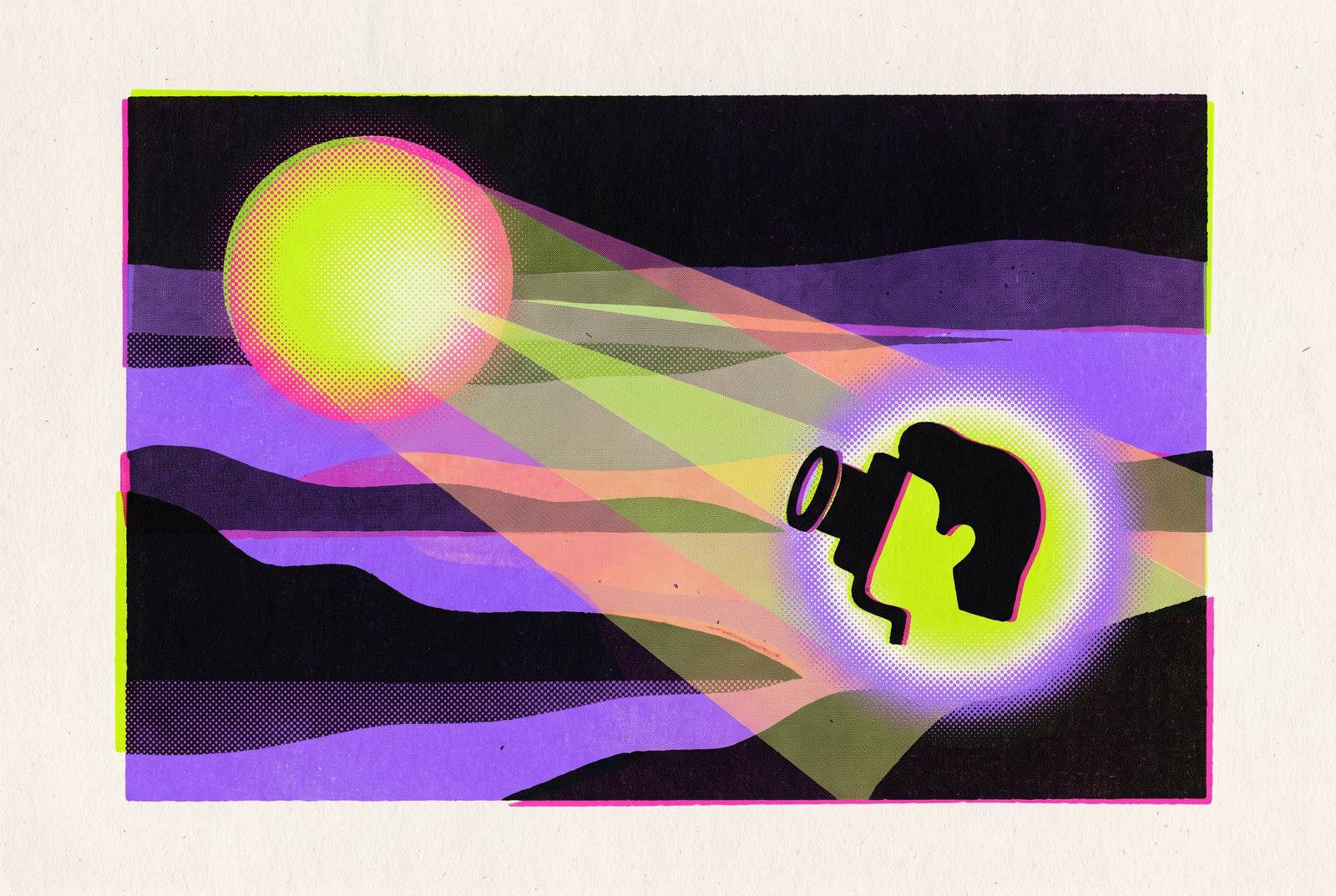
Flat AI video and cinematic AI video usually come from the exact same model. The difference almost never comes from the tool itself. It comes from whether the prompt tells the model what light to use, or leaves it to guess. Studies suggest a majority of viewers can detect AI-generated video, though the tells are consistent across findings. When people do catch a fake, the tell is almost never the subject or the motion. It's the light: flat, directionless, spread evenly across the frame like someone left a fluorescent tube running in every scene.
Cinematic lighting does real work before a single line of dialogue plays. It points the eye, builds depth, and tells the audience what kind of story they're watching, thriller or romance or sales pitch, mostly through where the shadows fall. A model left without lighting instructions doesn't make a creative choice. It defaults to whatever its training data averaged out, which tends to be soft, shadowless, and forgettable. Get the subject, the camera, and the action right and skip the lighting, and the output still reads flat. Most people get it backwards, spending an hour tuning the camera move and the subject description, then bolting on "cinematic lighting" as an afterthought. That's exactly backwards. Lighting is the highest-leverage layer in the whole prompt, and it should be the first thing written, not the last.
How AI models read lighting language, and what kinds of terms they actually parse
Video models running in 2026 track at least four layers at once: what the subject looks like, what the camera does, how light behaves, and how things physically move. Leave any one of those blank and the model doesn't pause to ask. It fills the gap with a guess pulled from the statistical middle of its training set.
Lighting terms work because they showed up again and again in labeled footage during training. "Golden hour," "low-key," "volumetric light," "candlelight." The model treats these as reliable signal, patterns tied to specific visual setups it's seen thousands of times over.
That's also why some descriptors do nothing. "Atmospheric," "moody," "dramatic" describe a feeling, not a light source, so the model has to guess what physical setup might produce that feeling. Compare that to "single desk lamp, from camera left, reflecting on wet pavement." That's a rig. The model knows exactly what to build.
Take "warm lighting" against "warm yellow from the bar practicals only." The first is a mood word. The second names the source (bar practicals), the color (warm yellow), and the constraint (only, no fill from anywhere else). One of those is a wish. The other is an instruction, and the gap between the two is the entire argument here.
This vocabulary isn't tied to one platform. Veo 3.1, Kling 3.0, Sora 2, and Seedance 2.0 each respond to natural-language lighting description, drawing on shared industry terminology that appears consistently across training footage. Name the light source, name the direction it's coming from, then name what it's doing to a surface, skin, pavement, glass, fabric. Three parts, every time.
The core lighting vocabulary every AI video prompt should draw from
Five categories cover almost everything a prompt needs. Skip a category and the gap shows up on screen. Pull from all five, not just one, and the light in the shot starts to feel designed instead of accidental.
Natural and time-of-day sources. Golden hour is the safest bet in the entire vocabulary: warm, low-angle, long shadows, and models render it reliably because it's so heavily represented in training footage. Blue hour, the low-light window at the edge of day, gives cool, flat, contemplative light. Overcast is underrated: diffused and shadowless, which sounds boring until it's exactly what a medical or product shot needs. Moonlight benefits from a number attached to it, something like 8000K plus "deep shadows," rather than the word "moonlight" sitting there alone. Midday sun runs around 120,000 lux and throws hard, ugly shadows unless that harshness is the point. Candlelight is around 1,800 to 1,900 Kelvin, which is why it always reads as intimate or old-world, sometimes both at once.
Artificial and practical sources. Neon needs a color named alongside it. "Pink neon glow" does more work than "neon glow" alone. Sodium streetlights give that amber-orange cast that's become shorthand for urban realism. Tungsten rim light separates a subject from the background with a warm edge, a classic portrait trick. A single desk lamp reads as contained and a little noir. Modern LEDs run a tunable range, roughly 2,700 to 6,500 Kelvin, so naming the CCT (color correlated temperature) directly controls whether a scene feels cozy or clinical.
Quality and texture. Soft versus hard is the most basic distinction in lighting, and the one most prompts skip. Soft light blurs shadow edges. Hard light sharpens them into hard lines. Diffused light wraps around a subject and kills drama, which is exactly why it suits commercial or instructional footage. Volumetric rays, sometimes called god rays, are light made visible by haze or dust in the air, and they signal scale instantly. Bloom is the soft glow around bright highlights, dreamlike and a little romantic. Haze is the physical stuff light travels through, different from bloom, which is what happens once light hits the lens. Film grain resists the too-clean, too-smooth look that gives away AI video at a glance.
Contrast ratio. Low-key means deep shadow and almost no fill, the language of thrillers and mystery. High-key means bright with barely any shadow, the register of commercials and upbeat content. Contrasty describes a wide tonal range without necessarily going dark.
Directionality. This is the most skipped category, and it's the most powerful one on the list, full stop. "From camera left" against "from camera right" changes the entire read on a face. A 45-degree angle from top-right edges toward Rembrandt lighting, the classic portrait setup with depth built in. Backlighting produces silhouette or rim-glow and separates a subject from its background hard. Rim light is a thin edge of light tracing a subject's outline. Uplighting, light from below, reads as unnatural and unsettling, standard in horror. Silhouette is the extreme case: maximum contrast, subject visible only as shape.
Color temperature and palette as mood controls, not decoration
Color temperature belongs in the lighting instruction itself, not tacked on afterward as a color-grade note. Specifying Kelvin values tells the model what kind of light source is actually in the room, not just what filter to slap over the footage in post.
Warm and cool carry consistent emotional weight. Lower Kelvin values, warm tones, read as intimate, comforting, appetizing. Higher Kelvin values, cool tones, read as clinical, tense, futuristic. That baseline holds up across basically every AI video model out there.
Specific grading language gets parsed the same way specific lighting language does. "Subtle teal-and-orange grade, soft film-like contrast" gives the model something to build. So does "muted pastel palette, low saturation, gentle bloom," or "neutral color balance, clean skin tones, minimal contrast." Naming a tonal mode, "split-toned amber and emerald," works far better than naming a feeling, "moody colors," because the tonal mode is the same input every single time it's used. The feeling gets re-rolled into something different with every generation, and that inconsistency is the real cost of vague prompting.
Keep atmosphere and mood as separate ideas, even though they're related. Atmosphere is physical: haze, rain, smoke, dust catching the light, reflections pooling on wet pavement. Mood is the emotional register, named directly: melancholic, anxious, euphoric, contemplative. Blend the two into a phrase like "atmospheric vibes" and the model has nothing concrete left to grab onto.
Film stock references compress a lot of instruction into a couple of words. Cinestill 800T is tungsten-balanced and known for halation, that red glow bleeding around light sources, and it's become shorthand for neon-lit night scenes and cyberpunk color. A workable approach: combine two or three film references, each steering a different quality of the image. Stacking too many references risks sending the model conflicting signals.
"Cool blue palette, soft lighting, low saturation" and "cool blue palette, dramatic lighting, high contrast" share the exact same color base, which is the part that trips people up. The results look nothing alike. Temperature sets the base. Contrast and lighting quality decide what actually happens on top of it.
Building the full lighting prompt: how descriptors fit into a complete scene instruction
A widely used structure, consistent with Kling AI's prompt guidance and applicable across other platforms, breaks a prompt into six slots: subject, action, scene, camera language, lighting and atmosphere, then mood or style register. Lighting belongs toward the latter half of that sequence. It never stands alone, and it has to work with whatever the camera and the subject are already doing.
Three to five descriptor elements per prompt is the sweet spot. Fewer than that, and the model doesn't have enough to go on. More than that, and the terms start contradicting each other: hard light and soft light in the same sentence, that kind of collision.
Three additions move quality up almost regardless of subject matter. Shallow depth of field is one, it signals professional intent on its own. A named, specific camera movement, dolly, track, orbit, rather than just "camera moves," is another. And one deliberate lighting term, golden hour, Rembrandt lighting, backlighting, beats five vague ones stacked on top of each other every time.
The gap shows up clearly in a before-and-after. "Cinematic shot of a woman in a bar, moody lighting" gives the model almost nothing, just two adjectives dressed up as instructions. Compare it to: "close-up, slow dolly-in, 85mm, shallow depth of field, warm yellow from the bar practicals only, split-toned amber and emerald palette, light haze, melancholic register, in the style of Wong Kar-wai, not photorealistic-clean, film grain texture." Every term in that second version names a physical setup or a specific tonal target. None of it is a mood word standing in for an instruction.
The vocabulary can go further, into full lighting-rig language, when a shot needs precision: "Hard key light at 5600K (daylight) from 45 degrees camera-left. Very low-intensity 6500K (cool overcast) fill light adding a subtle blue tint to shadows. Powerful 3000K (tungsten) rim light from behind creating a warm golden silhouette and hair glow." That's three-point lighting, described the way a gaffer would describe it on set, and it reads to the model as three lights, three purposes.
Direction, temperature, and quality (soft versus hard) are the three axes that actually move the needle, more than any other combination of terms. The same subject in the same location looks like two different films under golden hour from camera-left versus flat overcast light. Lens choice ties into this too: Lens choice ties into lighting in practical ways: a tighter focal length isolates the subject and suits contained, deliberate light sources, while a wider one pulls the subject into its environment and works naturally alongside ambient or atmospheric light.
How Veo 3.1, Kling 3.0, Sora 2, and Seedance 2.0 handle lighting prompts differently
By early 2026, most major AI video models generate 4K output as a baseline, and several produce synced audio natively. Lighting prompt behavior still varies quite a bit underneath that shared baseline, model to model, and picking the wrong one for the job wastes render credits on retries.
Veo 3.1, from Google, rates highest on prompt adherence in MovieGenBench evaluations. It holds character and product consistency across multiple shots better than most competitors, which makes it the stronger pick for ecommerce and brand work where a product or a face needs to look identical from cut to cut, lighting included.
Sora 2, from OpenAI, launched September 30, 2025, with a Pro tier available at launch, adding synced dialogue and better scene physics. It leads on photorealism and how naturally light behaves across a scene. Its limitation: keeping lighting consistent across a cast of people, shot to shot, takes more deliberate prompt work than it does on some competing platforms.
Kling 3.0, from Kuaishou, runs on a platform with more than 22 million users and supports native audio, multi-shot creation, and reference-based consistency. Pair the "motion brush" tool, meant for small localized movements, with low-key or high-key language to lock mood across a multi-shot sequence, a platform-specific trick worth using. Prompt order also matters more here than on other platforms. Palette first, then lighting, then camera instructions, functions as a priority stack the model reads roughly in that order. At around 50 cents a clip, it's built for high-volume, low-cost output, not for the one perfect hero shot, and treating it like a Sora replacement is a waste of its actual strength.
Seedance 2.0, from ByteDance, showed strength in cinematic quality metrics in independent benchmarks reviewed in early 2026. It's particularly strong on slow tracking shots and dramatic dolly moves, so lighting descriptors that tie atmosphere to movement, volumetric haze drifting past camera, long shadows sweeping as the dolly tracks, land especially well here. It also generates audio and visual jointly rather than layering audio in afterward. At launch, it posted a competitive Elo score on the Artificial Analysis text-to-video leaderboard, ranking among the top models at that time.
One technique carries across all four: anchor the lighting state in a reference frame first, then extend the video from that frame. That's the reliable way to lock a specific look before the model gets a chance to drift off it, and skipping this step is why long-form outputs so often lose their lighting halfway through.
VideoGen brings Veo, Kling, Sora, and other leading models into one interface, so the lighting vocabulary covered here doesn't need to get relearned for each platform separately. A prompt can be tested across models to see which one renders the intended look most faithfully, then the winning version gets scaled up from there, without switching tools or rebuilding a workflow each time. A built-in editor also means lighting fixes based on what actually rendered don't require a separate trip through post-production software.
Lighting descriptor sets for five common AI video use cases
Brand and product commercials call for high-key lighting, soft diffused fill, neutral color balance, and clean skin tones with minimal contrast. A workable prompt for a hero product shot: "Camera orbits around [product] on velvet surface. Soft studio lighting emphasizes texture. Shallow depth of field." Pairing that with 85mm compression keeps the product sharp and separated from its background.
Social content, vertical and short-form, leans on warm golden tones for food and lifestyle footage, or brighter, punchier combinations, "bright orange and red hues, high-key, glossy highlights, subtle bloom," for fitness content or product launches that need energy. Specifying 9:16 aspect ratio in the prompt matters here too, since a tighter vertical frame makes side lighting read more dramatically than it would in a wide shot. Product video has been shown to lift conversion substantially, so lighting precision in this category is a conversion driver in its own right. It's a conversion lever, tied directly to how well the content sells.
Cinematic narrative and mood-driven content starts from low-key lighting: deep shadows, minimal fill, the foundation nearly every dramatic or suspenseful piece builds from before adding direction, color temperature, and texture on top.